Example 3.2#
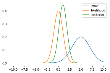
Below, we examine the visualisation of Example 3.2 in the notes, in the case of a Bayesian posterior.
Recall that, we have a Gaussian prior and likelihood in the form
\[\begin{align*}
p(x) &= \mathcal{N}(x \mid \mu_0, \sigma_0^2) \\
p(y \mid x) &= \mathcal{N}(y \mid x, \sigma^2).
\end{align*}\]
We have derived this posterior in Example 3.2 but below we will demonstrate the visualisation of this posterior.
import numpy as np
import matplotlib.pyplot as plt


def prior(x, mu0, sigma0):
    return np.exp(-0.5 * (x - mu0) ** 2 / sigma0 ** 2) / np.sqrt(2 * np.pi * sigma0 ** 2)

def likelihood(x, y, sigma):
    return np.exp(-0.5 * (y - x) ** 2 / sigma ** 2) / np.sqrt(2 * np.pi * sigma ** 2)

def posterior(x, y, mu0, sigma0, sigma):
    mu_p = (sigma ** 2 * mu0 + sigma0 ** 2 * y) / (sigma ** 2 + sigma0 ** 2)
    sigma_p = np.sqrt(sigma ** 2 * sigma0 ** 2 / (sigma ** 2 + sigma0 ** 2))
    return np.exp(-0.5 * (x - mu_p) ** 2 / sigma_p ** 2) / np.sqrt(2 * np.pi * sigma_p ** 2)


xx = np.linspace(-10, 10, 1000)
y = 0.0
mu0 = 5.0
sigma0 = 2.0
sigma = 1.0

plt.plot(xx, prior(xx, mu0, sigma0), label='prior')
plt.plot(xx, likelihood(xx, y, sigma), label='likelihood')
plt.plot(xx, posterior(xx, y, mu0, sigma0, sigma), label='posterior')
plt.legend()
plt.show()
You can play by downloading this notebook and changing mean or observation location to gain intuition.